Gender Pay Gap Map
Choropleth maps visualising pay gaps in the UK
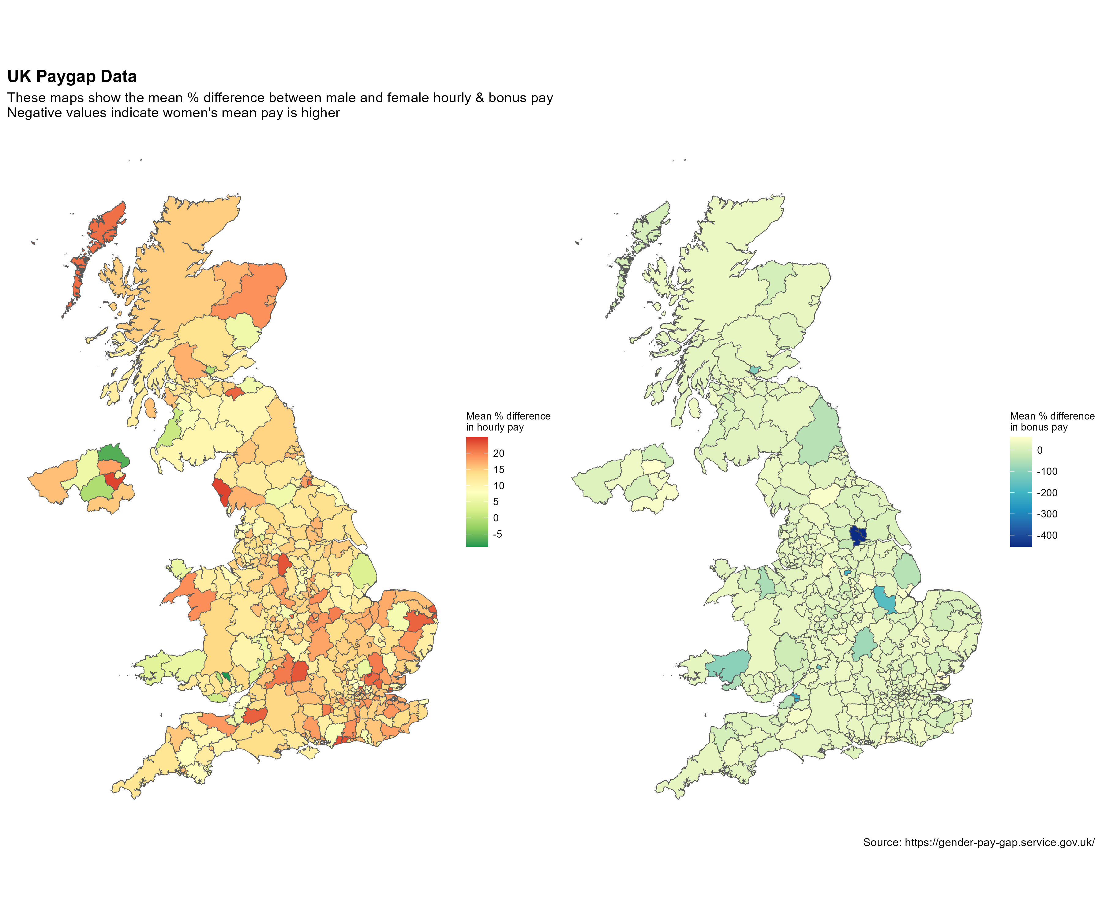
Introduction
I used data from the UK Gender Pay Gap Service to highlight the gendered disparity in pay between men and women in the UK.
Methodology
The dataset has almost 49,000 entries across 27 variables for each of the companies that made a submission. I chose to focus on the mean values in difference between hourly and bonus pay across genders for each entry.
To do this, I took the relevant mean values and post codes and essentially performed a lookup with a separate dataset of UK postcodes to obtain the local authority names. This dataframe was combined with a shapefile of UK local authorities. I was then able to summarise the data using the mean value in the differences per local authority.
Limitations
This approach does have limitations, specifically by using mean values per local authority results in data that is not standardised. Neverthless, the intention of this small project was to put together a visualisation rather than conduct an in-depth analysis of the data.
R Code
The full code is available on GitHub by clicking here.