Time Series Analysis
A time series analysis of Revolut spending data
time series
forecasting
analysis
Revolut Spending Data
This time series analysis focuses on weekly data available from the Office for National Statistics (ONS). Revolut is one of a number of digital banks that have emerged in recent years and it has around 4.8 million users within the UK financial payment ecosystem. The bank has been providing data to the ONS since the start of the COVID-19 pandemic and the ONS indexes data at the average February 2020 spending level as a pre-pandemic baseline. They also apply a 7-day rolling average to the data to take into account any intra-week spending cyclicality.
While this data is useful for analysing spending changes since 2020 it is important to note a number of limitations:
Revolut customers tend to be younger and more metropolitan than the average UK consumer, so spending may not be representative of the overall UK macroeconomic picture.
The indices in the dataset do not take into account inflation and are presented on a nominal basis and are not adjusted for price increases over time. According to the ONS the CPI rate was at 1.8% in January 2020 but by January 2023 was at 10.1%.
Within the UK financial transaction ecosystem there has been a shift away from cash as a payment medium in favour of card spending. This results in indices being uplifted over time in areas where consumers replace low value cash transactions with low value card transactions instead. This is more likely to be true in this dataset given the demographic profile of Revolut customers.
The full background on methodology and limitations is available from the ONS here.
Time Series Analysis
This project utilizes the indexed rolling 7-day average total spend value from the spending by sector data to identify trends and forecast 28 days ahead. For the analysis, I will use the following methods: exponential smoothing, ARIMA, and forecasting using Prophet.
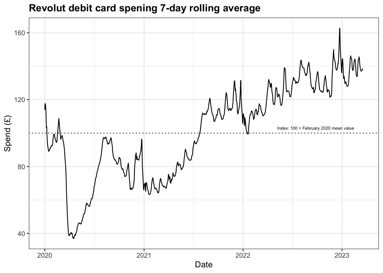
After some initial cleaning of dataset to ensure it is in the correct format to conduct time series analysis in R, figure 1 shows plot of the spending over time shows how these levels changed over the course of the pandemic.
In general, what we can see is a clear upward trend across the three years and some seasonality exhibited around August and December-January. While the initial lockdown might be easily identifiable by the sharp dip during Q1 2020, it may be helpful to provide a reminder of all the restrictions implemented during the pandemic, and the plot below adds further context.
The red lines are indicative of the main lockdowns and the restrictions imposed due to the emergence of the Omicron variant in late 2021. Although there were many stages of ‘unlocking’ of restrictions, I have chosen to highlight two key moments with green lines.
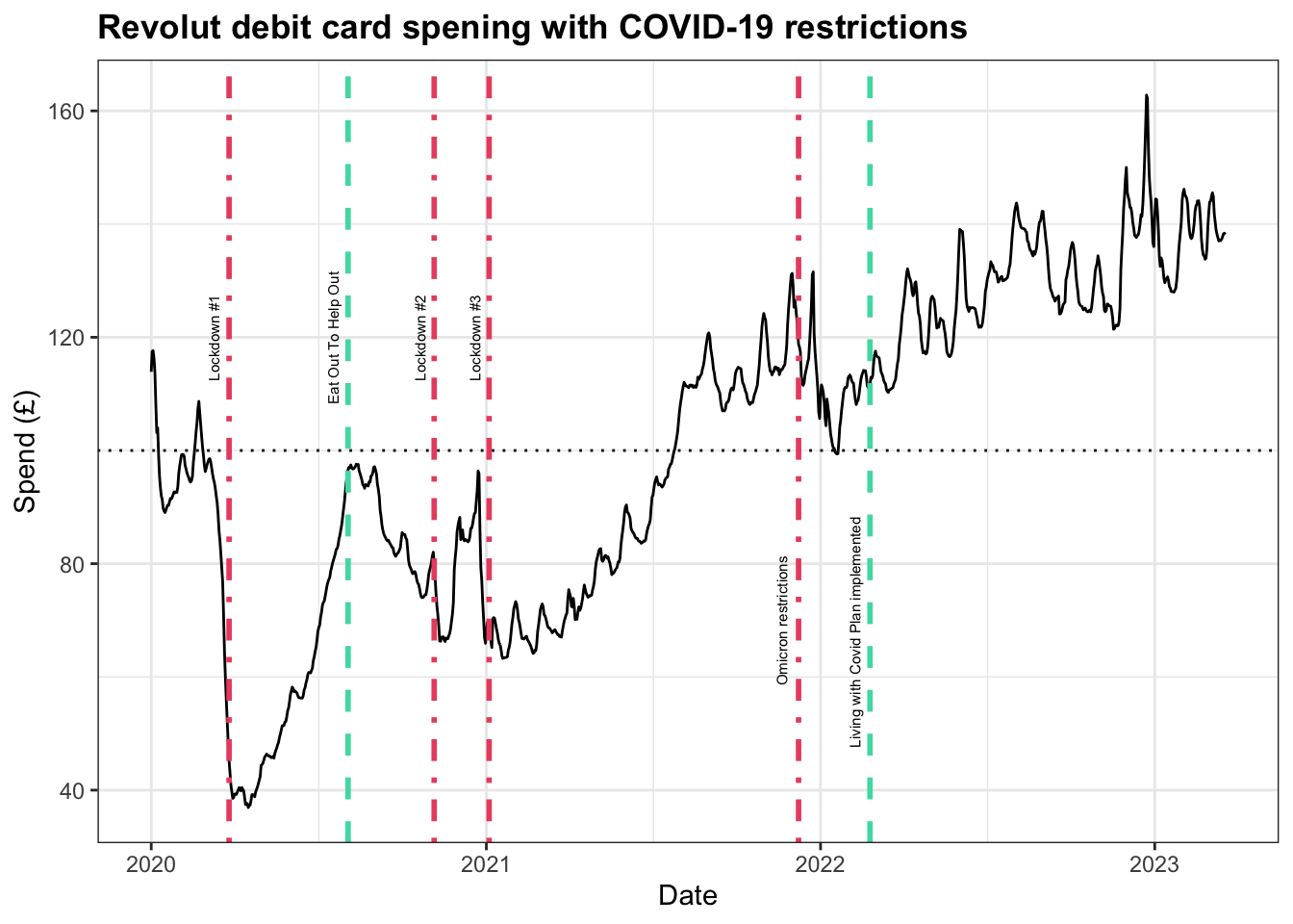
The first of these easing periods is the Eat Out To Help Out programme during August 2020 which offered discounted meals in pubs, restaurants, and other hospitality outlets to support the sector. The second is in February 2022 when official COVID-19 restrictions were ended under the Living With Covid Plan. As a result of these two interventions, we can clearly identify periods of sustained spending as people had greater freedom of movement in their daily lives.
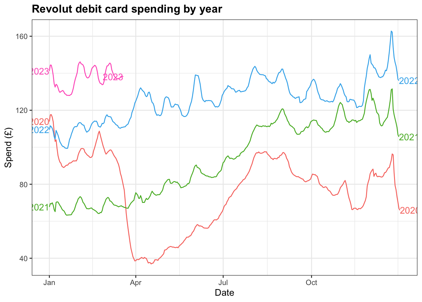
In spite of this, plotting the years against each reveals patterns in the second half of the year, particularly through Q4, that are broadly similar.
Exponential Smoothing
Holt’s method with trend
For this dataset I have chosen to experiment with the exponential smoothing method with trend and then later add in the seasonality component to determine if this improves the forecast.
fit <- rs3 |>
  model(
    `Holt's method` = ETS(Total ~ error("A") + trend("A") + season("N"))
  )
fabletools::report(fit)
Series: Total
Model: ETS(A,A,N)
Smoothing parameters:
alpha = 0.9998998
beta = 0.7845457
Initial states:
l[0] b[0]
111.1182 2.71086
sigma^2: 1.4885
AIC AICc BIC
8771.040 8771.092 8796.381 This trended exponential smoothing model has a very high alpha value indicating that values in the past are given less weight than more recent values due to the exponential decaying built into the model. In addition, the beta value is high and this takes into changes in the data.
Plotting the forecast of the next 28 days sees quite a steady decline in the mean value and quite a wide distribution across both the 80% and 95% intervals, with the lower and upper bounds of the 95% interval ranging below 0 and close to 300.
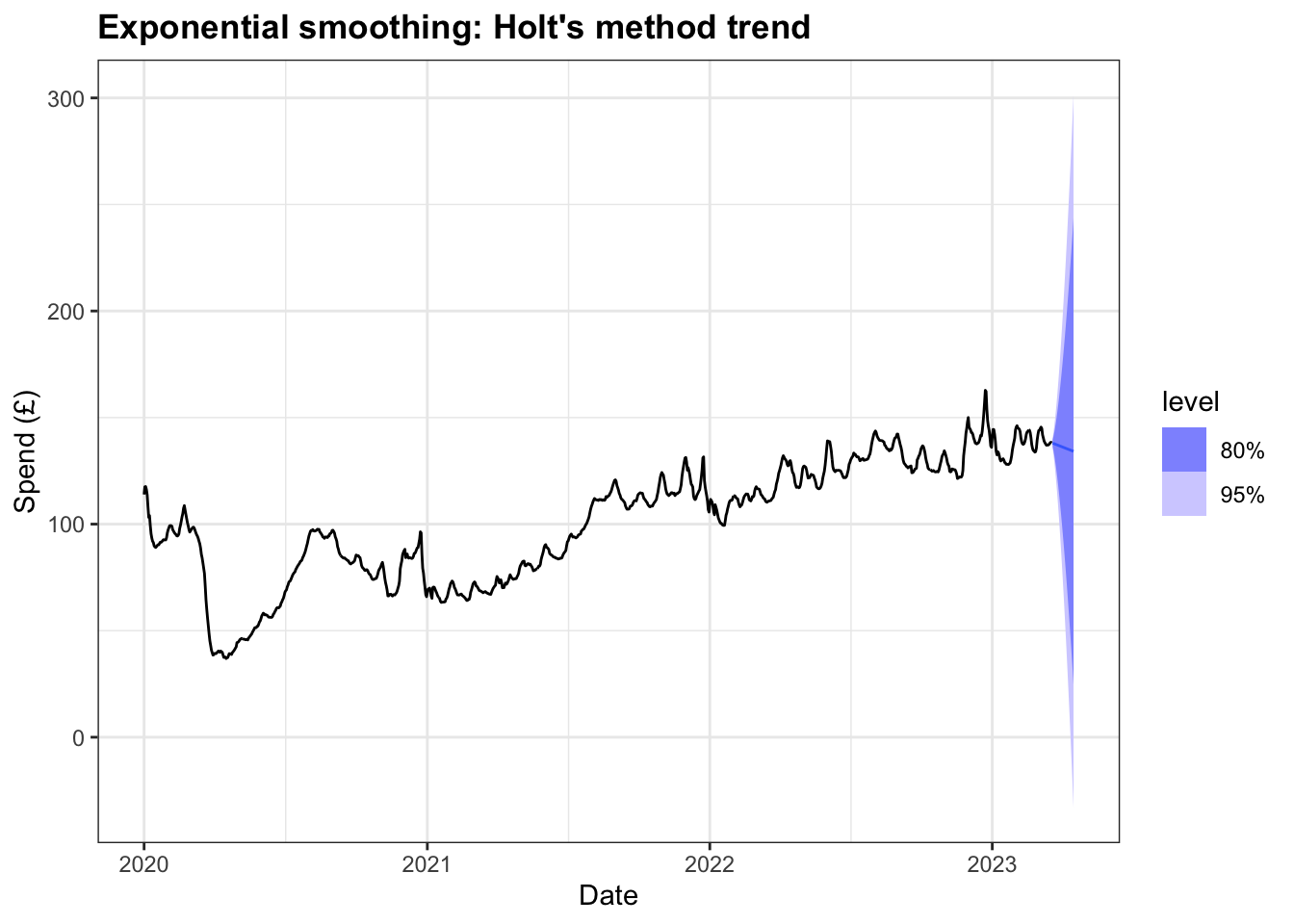
Given the macroeconomic conditions in the British economy are have not been particularly positive, this decline might not seem unreasonable and the model may benefit from the introduction of some level of dampening so as not to over-forecast.
fit2 <- rs3 |>
    model(`Damped Holt's method` = ETS(Total ~ error("A") +
                                         trend("Ad") + season("N"))
    )
fabletools::report(fit2)
Series: Total
Model: ETS(A,Ad,N)
Smoothing parameters:
alpha = 0.9998987
beta = 0.8161713
phi = 0.8000001
Initial states:
l[0] b[0]
121.2629 -1.124004
sigma^2: 1.394
AIC AICc BIC
8694.973 8695.045 8725.382 The model estimates phi, the dampening coefficient, to be 0.80 and we see a slight decrease in the alpha and increase beta values. This dampened model also performs better compared top the previous model when we compare AIC, AICc, and BIC values. The table below compares the two models and we can see that the damped Holt’s method has a lower RMSE so makes it a better choice.
rs3 |>
    model(
        `Holt's method` = ETS(Total ~ error("A") + trend("A") + season("N")),
        `Damped Holt's method` = ETS(Total ~ error("A") +
                                         trend("Ad") + season("N"))
        ) |> accuracy()
# A tibble: 2 × 10
.model .type ME RMSE MAE MPE MAPE MASE RMSSE ACF1
<chr> <chr> <dbl> <dbl> <dbl> <dbl> <dbl> <dbl> <dbl> <dbl>
1 Holt's method Trai… -0.00310 1.22 0.728 0.0164 0.742 0.144 0.175 0.0516
2 Damped Holt's meth… Trai… 0.00414 1.18 0.689 0.0141 0.702 0.136 0.169 0.0136The forecasts from the damped model also exhibit less variability in the 80% and 95% intervals than the earlier model.
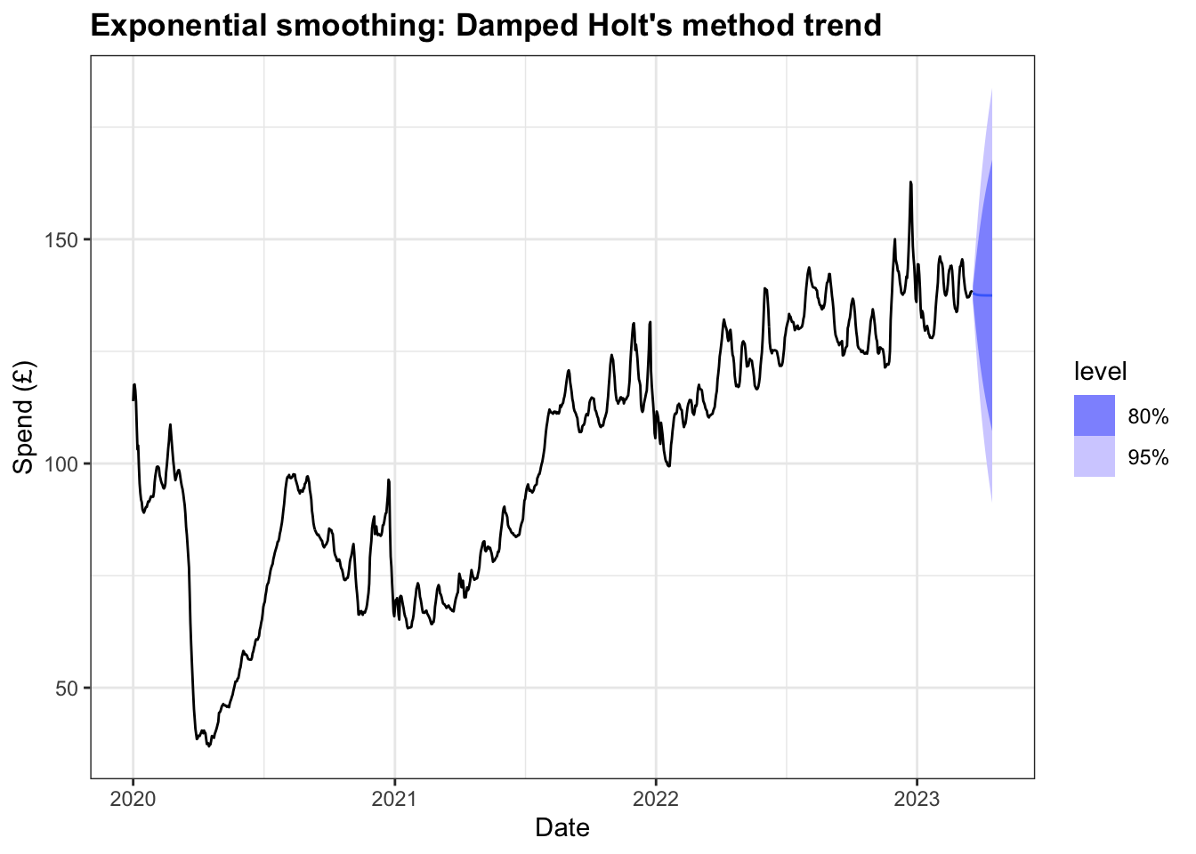
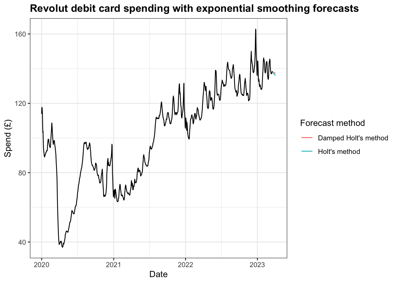
When comparing the two forecasts, the dampened forecast, unsurprisingly, decreases less rapidly or as extreme at the median value.
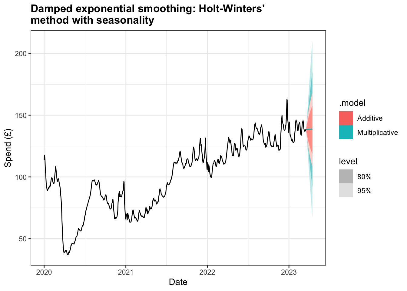
Holt-Winters’ method with seasonality
To add in a seasonality component to the model we can use the Holt-Winters’ method either with an additive seasonality component, which assumes the seasonal variations within the time series to be approximately constant, or multiplicative seasonality component, where the assumption is that the variations are proportional to the level of the series.
With the initial modelling, we can see that the additive model performs better with its lower AIC, AICc, and BIC values, in addition to lower MSE and AMSE values.
# A tibble: 2 × 9
  .model           sigma2 log_lik   AIC  AICc   BIC   MSE  AMSE    MAE
  <chr>             <dbl>   <dbl> <dbl> <dbl> <dbl> <dbl> <dbl>  <dbl>
1 Additive       1.78      -4483. 8990. 8990. 9051.  1.77  7.62 0.811
2 Multiplicative 0.000265  -4674. 9371. 9371. 9432.  2.83  9.74 0.0104
The difference between the two models is evident when forecasting the next 28 days, with the mean values for additive model increasing while the multiplicative model shows a decline.
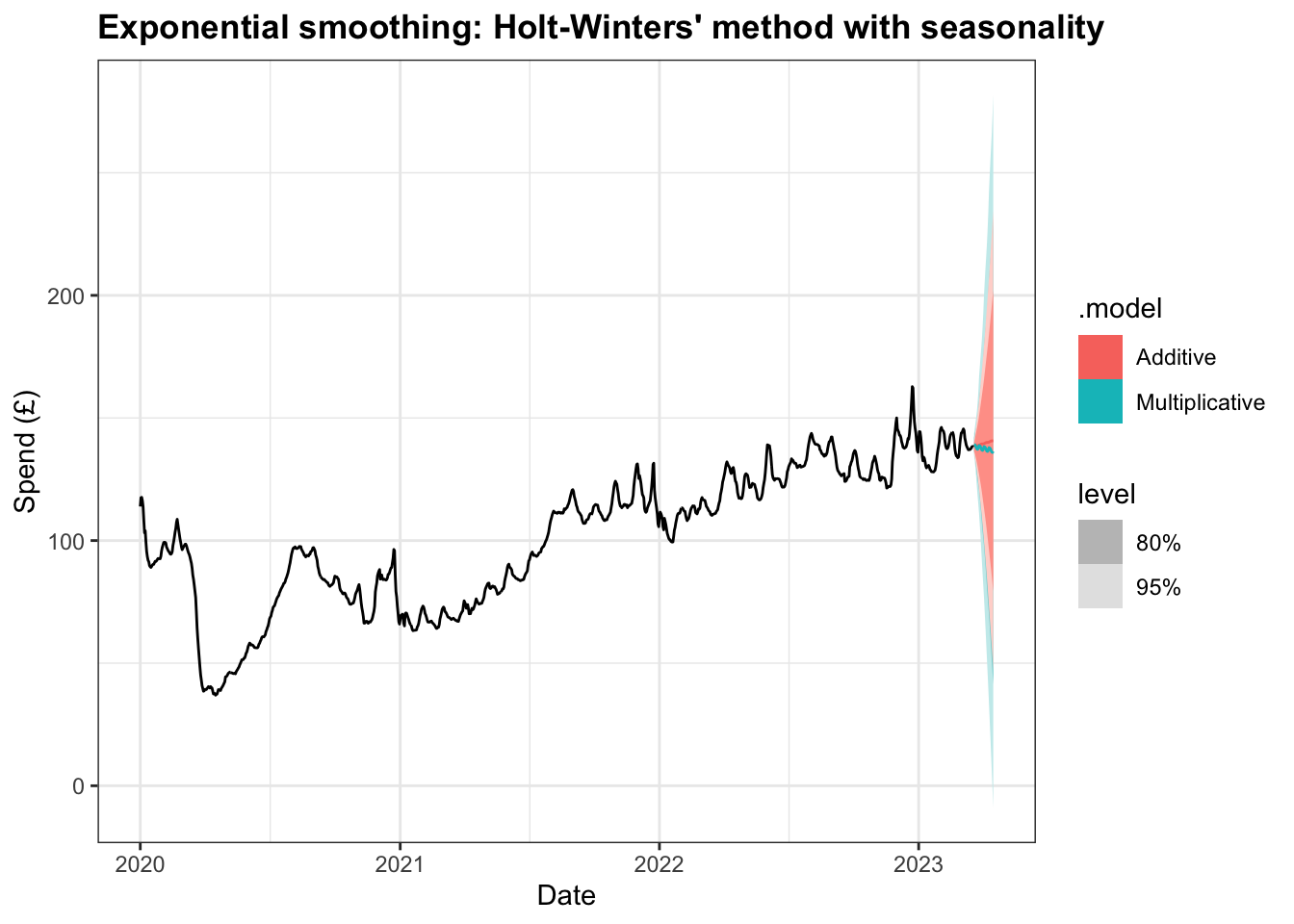
Similarly, the RMSE for the additive model is better than multiplicative one, although it does not perform as well as the RMSE for the damped Holt’s method above.
# A tibble: 2 × 10
  .model         .type           ME  RMSE   MAE    MPE  MAPE  MASE RMSSE  ACF1
  <chr>          <chr>        <dbl> <dbl> <dbl>  <dbl> <dbl> <dbl> <dbl> <dbl>
1 Additive       Training  0.000715  1.33 0.811 0.0304 0.827 0.161 0.191 0.323
2 Multiplicative Training -0.00684   1.68 1.03  0.0278 1.04  0.203 0.242 0.374
However, it is possible to combine the dampened trend method with both additive and multiplicative seasonality. Both models see a drop in MSE and the AIC, AICc, and BIC values fall significantly, with the dampened multiplicative Holt Winter’s method having very similar values to the dampened Holt’s method. The RMSE value improves but not to the extent that either model match the model using damped Holt’s method.
# A tibble: 2 × 9
  .model           sigma2 log_lik   AIC  AICc   BIC   MSE  AMSE     MAE
  <chr>             <dbl>   <dbl> <dbl> <dbl> <dbl> <dbl> <dbl>   <dbl>
1 Additive       1.57      -4406. 8839. 8839. 8905.  1.55  6.04 0.749
2 Multiplicative 0.000157  -4368. 8762. 8762. 8827.  1.66  6.78 0.00786
# A tibble: 2 × 10
.model .type ME RMSE MAE MPE MAPE MASE RMSSE ACF1
<chr> <chr> <dbl> <dbl> <dbl> <dbl> <dbl> <dbl> <dbl> <dbl>
1 Additive Training 0.00681 1.25 0.749 0.0165 0.761 0.148 0.179 0.327
2 Multiplicative Training 0.000218 1.29 0.778 0.0210 0.788 0.154 0.185 0.324The plot here of the 28 day ahead forecast exhibits shallower increases for both models and a narrower set of intervals at 80% and 95%.
Model selection
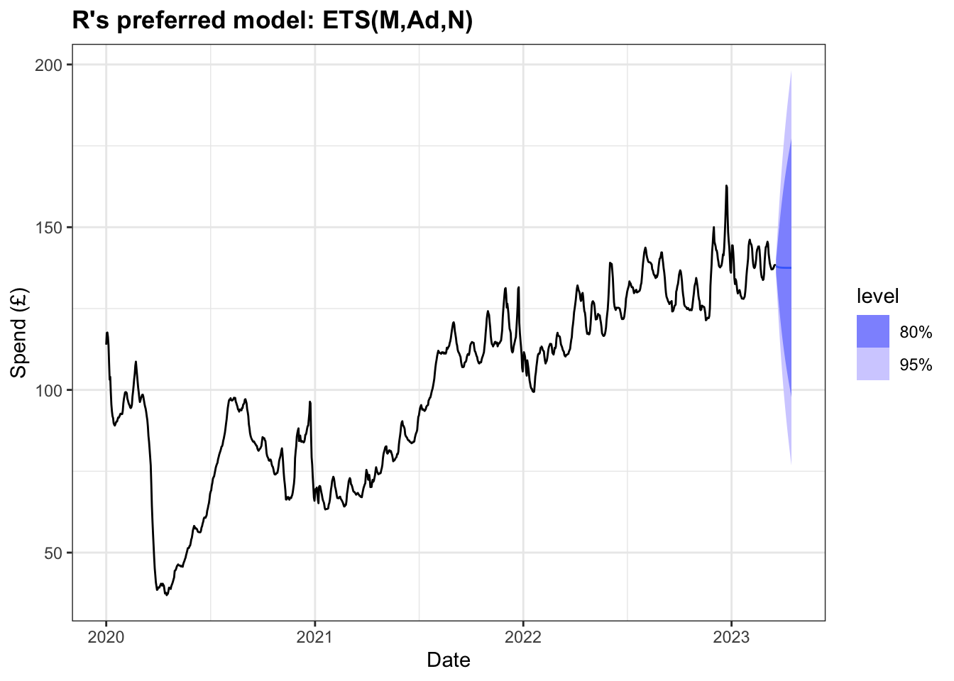
Having previously worked through a number of combinations of exponential smoothing models, both with and without dampening or seasonality, it seems that the damped Holt’s method without seasonality performed best when comparing AICc and RMSE values. However, it’s possible to employ the ETS() function in R to generate a model that minimises the AICc value.
Series: Total
Model: ETS(M,Ad,N)
  Smoothing parameters:
    alpha = 0.9999
    beta  = 0.7938542
    phi   = 0.8000637

  Initial states:
     l[0]      b[0]
 116.3569 -5.895034

  sigma^2:  1e-04

     AIC     AICc      BIC
8529.853 8529.925 8560.262
Comparisons between this preferred model and the damped Holt’s model from earlier are below:
# A tibble: 2 × 9
  .model                 sigma2 log_lik   AIC  AICc   BIC   MSE  AMSE     MAE
  <chr>                   <dbl>   <dbl> <dbl> <dbl> <dbl> <dbl> <dbl>   <dbl>
1 R Preferred          0.000130  -4259. 8530. 8530. 8560.  1.33  6.13 0.00697
2 Damped Holt's method 1.39      -4341. 8695. 8695. 8725.  1.39  6.17 0.689
# A tibble: 2 × 10
.model .type ME RMSE MAE MPE MAPE MASE RMSSE ACF1
<chr> <chr> <dbl> <dbl> <dbl> <dbl> <dbl> <dbl> <dbl> <dbl>
1 R Preferred Trai… 0.00912 1.15 0.684 0.0186 0.698 0.135 0.166 0.0745
2 Damped Holt's method Trai… 0.00414 1.18 0.689 0.0141 0.702 0.136 0.169 0.0136The output above tells us the model preferred by R uses Holt’s method where the error is multiplicative (rather than additive as has been used in the examples above), with an additive trend that is dampened. The value for alpha is very high, reflecting how the weight of the past observations decays quite rapidly. The AICc value is the lowest of all the models we have tested above.
The forecast of the next 28 days reflects the marginal decline exhibited in some of the other dampened models above. Given that the alpha value is relatively high it is not unsurprising that this model forecasts the mean value to be close to the total 7-day average spend in 2023.
We can use cross-validation based on a rolling forecasting origin, starting at the end of 2022 (chosen due to the impact of the pandemic prior to that) and increasing by one step each time. The result of this process is that the model preferred by R performs the best both when comparing AICc and RMSE.
# A tibble: 2 × 9
  .model                 sigma2 log_lik   AIC  AICc   BIC   MSE  AMSE     MAE
  <chr>                   <dbl>   <dbl> <dbl> <dbl> <dbl> <dbl> <dbl>   <dbl>
1 R Preferred          0.000130  -4259. 8530. 8530. 8560.  1.33  6.13 0.00697
2 Damped Holt's method 1.39      -4341. 8695. 8695. 8725.  1.39  6.17 0.689
# A tibble: 2 × 10
.model .type ME RMSE MAE MPE MAPE MASE RMSSE ACF1
<chr> <chr> <dbl> <dbl> <dbl> <dbl> <dbl> <dbl> <dbl> <dbl>
1 Damped Holt's method Test 0.841 9.92 7.73 0.492 5.58 1.53 1.43 0.979
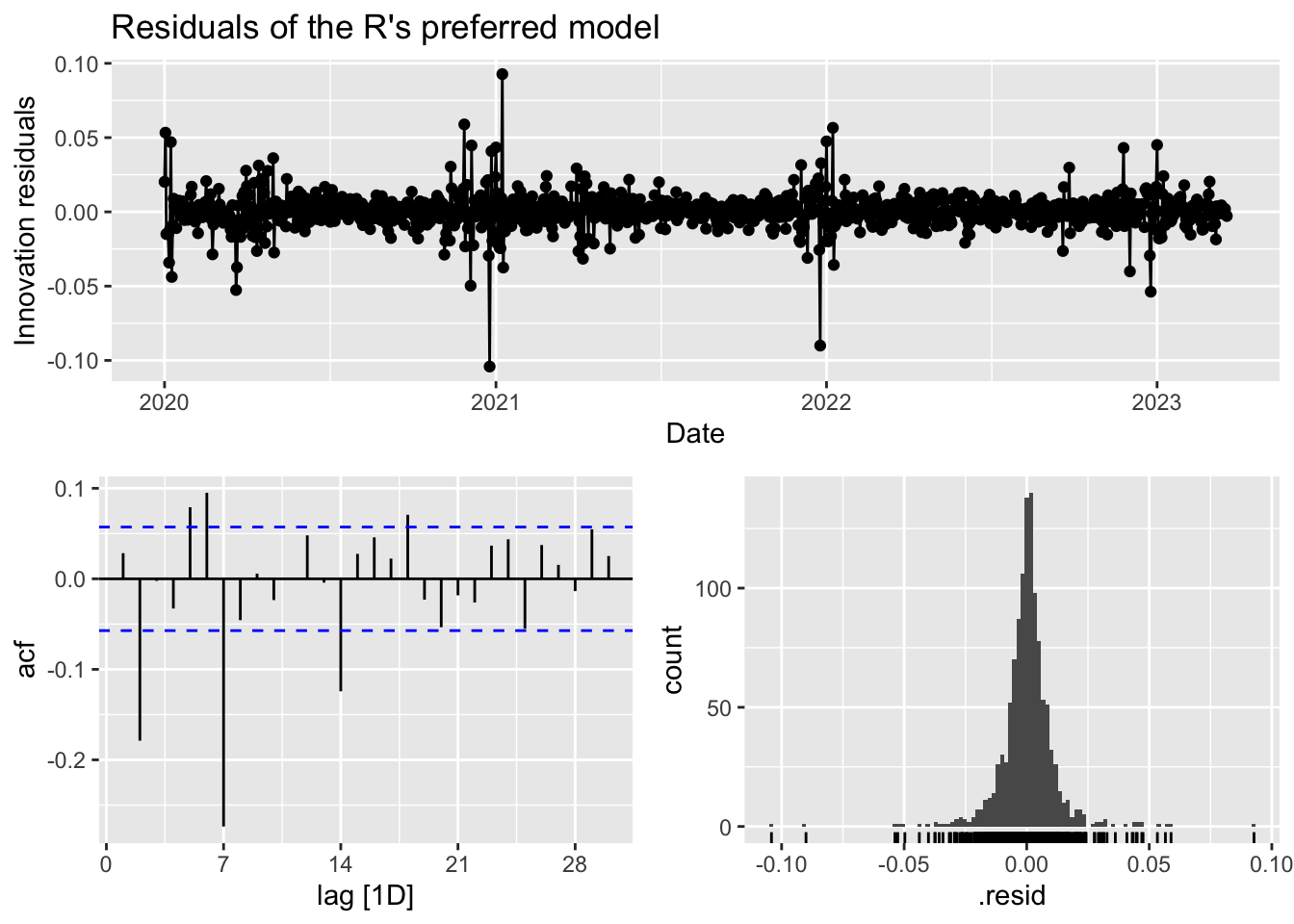
2 R Preferred Test 0.912 9.77 7.66 0.544 5.53 1.52 1.40 0.979Checking the residuals of R’s preferred model, we can see that the innovation residuals appear to have a constant variance and mean of zero. The histogram exhibits some degree of normality although the peak is a little high. The ACF plot have a number of significant that decay exponentially.
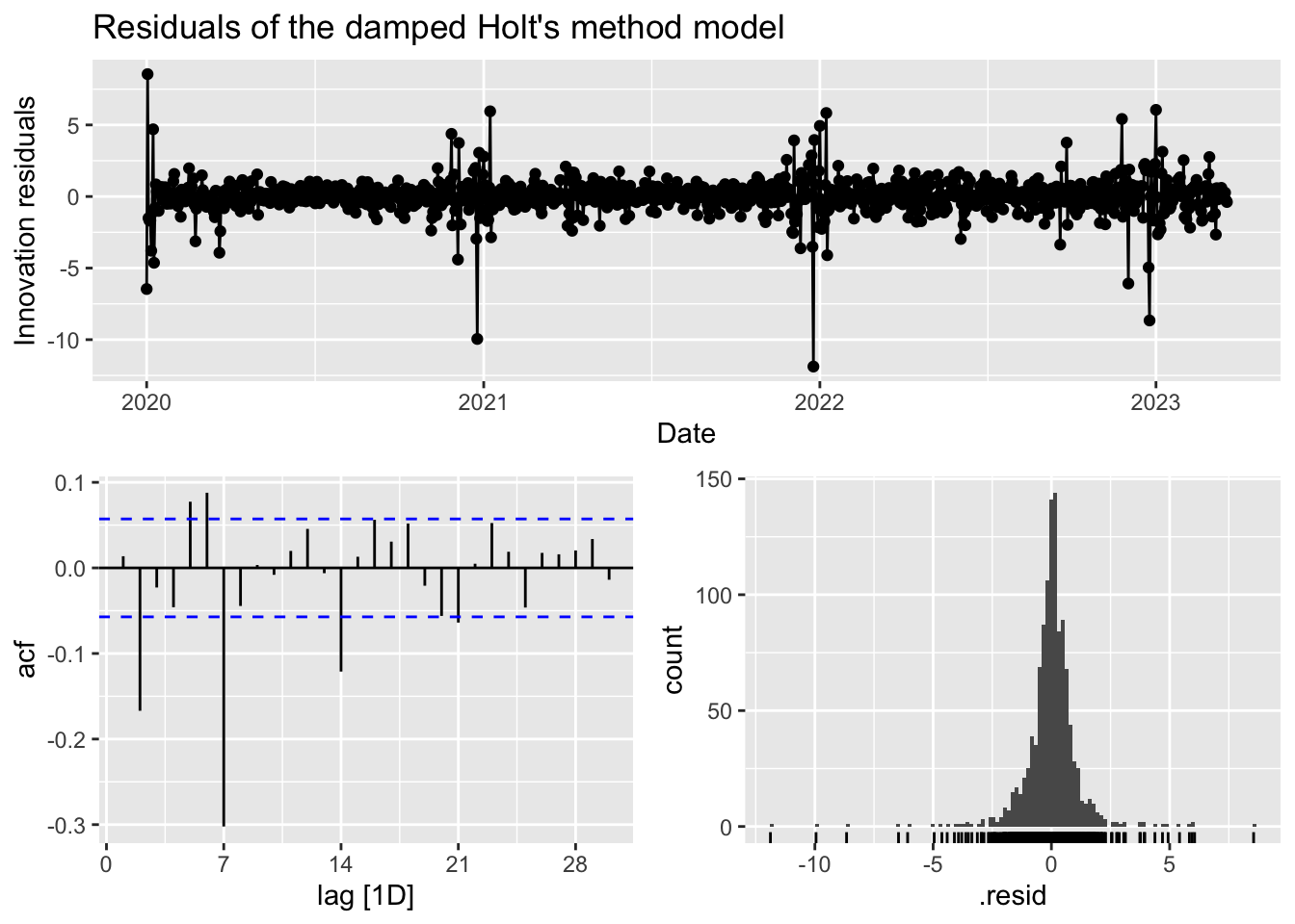
In contrast to the damped Holt’s method model, while the residuals have a mean of zero, the variance does appear to increase as we reach the end of 2022 and start 2023. The histogram is slightly left-skewed and peaks so may also fail the normality test. The ACF plot bears some similarity to R’s preferred model with a number of significant lags and before decaying. Given this, R’s preferred model seems to be the better model.
ARIMA modelling
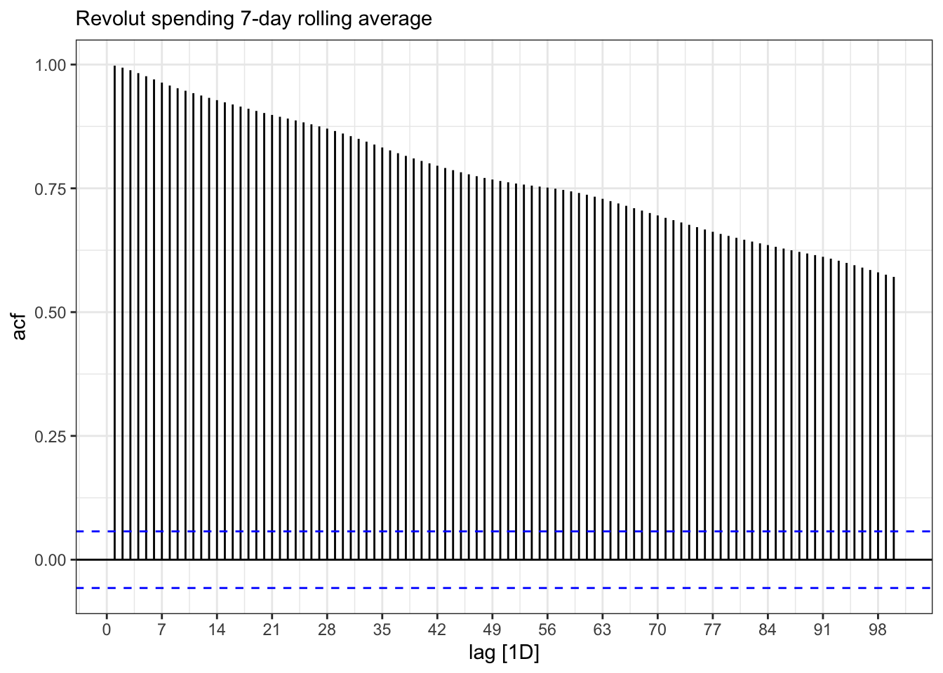
Looking at the initial plot of data above, it is clear that the data is not stationary and the ACF plot below shows the same data when it is not differenced up to lag 100. The lags remain significant are taking a long time to decay because each is correlated to the previous one. This makes sense when we consider that each daily value in the dataset relates to rolling 7-day average spend so we would expect correlation between the current and previous values.
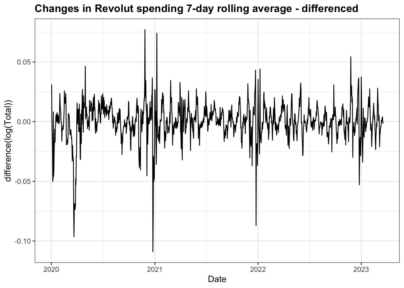
To make the data stationary, I have had to apply a log transformation to stabilise the variance and first order differencing to stabilise the mean. The resulting plot has a number of significant spikes around the time of lockdown restrictions being introduced, but overall resembles white noise.
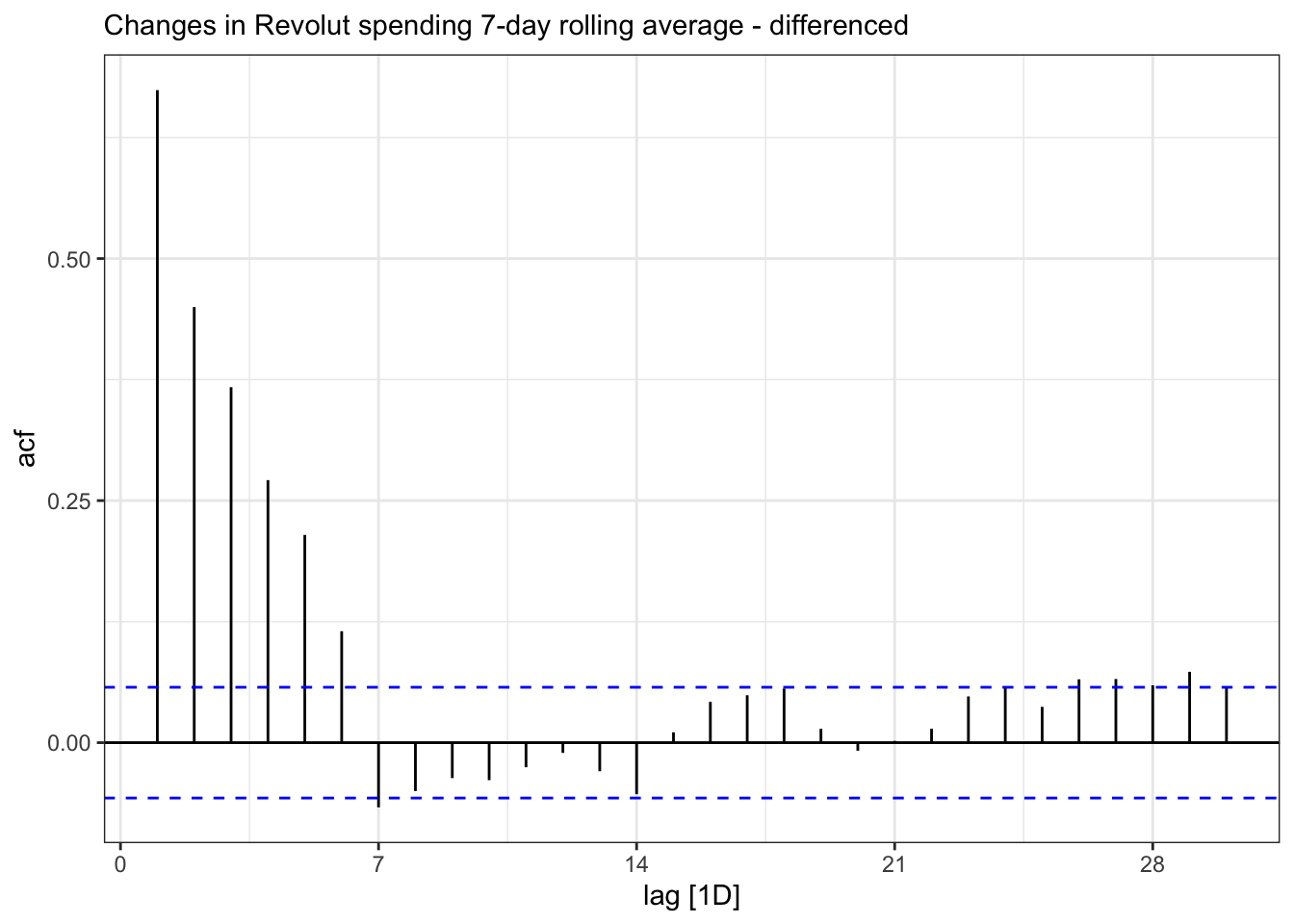
The differenced ACF plot exhibits significant lags up to lag 6 before decaying away.
It is also possible to confirm stationarity of this differenced data with a KPSS unit root test, which gives a small test statistic and a p-value of 0.1 and allows us to assume the data is stationary:
# A tibble: 1 × 2
  kpss_stat kpss_pvalue
      <dbl>       <dbl>
1     0.139         0.1
The time plot and ACF & PACF plots of the stationary data are show below.
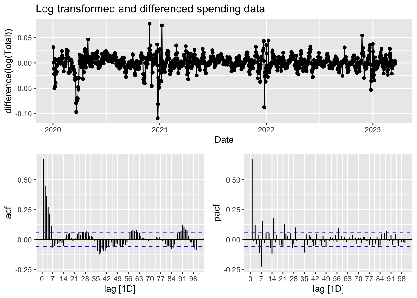
Given the data is a 7-day rolling average and that the ACF plot appears to show a sinusodial and seasonal pattern of aproximately 7 days, a seasonal ARIMA model would be appropriate. In order to achieve this, I will let R try to find the best model order. The first is the default stepwise procedure and the second one works harder to search for a better model.
ar_fit <- rs3 |> model(stepwise = ARIMA(Total),
             search = ARIMA(Total, stepwise=FALSE, approx = FALSE))
As we can from the output here, R has ARIMA(3,1,0)(1,0,1)7 for both models
# A mable: 2 x 2
# Key:     Model name [2]
  `Model name`                   Orders
  <chr>                         <model>
1 stepwise     <ARIMA(3,1,0)(1,0,1)[7]>
2 search       <ARIMA(3,1,0)(1,0,1)[7]>
# A tibble: 2 × 6
.model sigma2 log_lik AIC AICc BIC
<chr> <dbl> <dbl> <dbl> <dbl> <dbl>
1 stepwise 0.955 -1640. 3292. 3292. 3322.
2 search 0.955 -1640. 3292. 3292. 3322.The residuals, as shown below, appear to have a constant mean and variance in the time plot and the ACF, whilst show some spikes appears consistent with white noise. However, the model fails the Ljung-Box text for white noise. This model is still left-skewed and peaks a little too high in the histogram, thus failing the normality test.
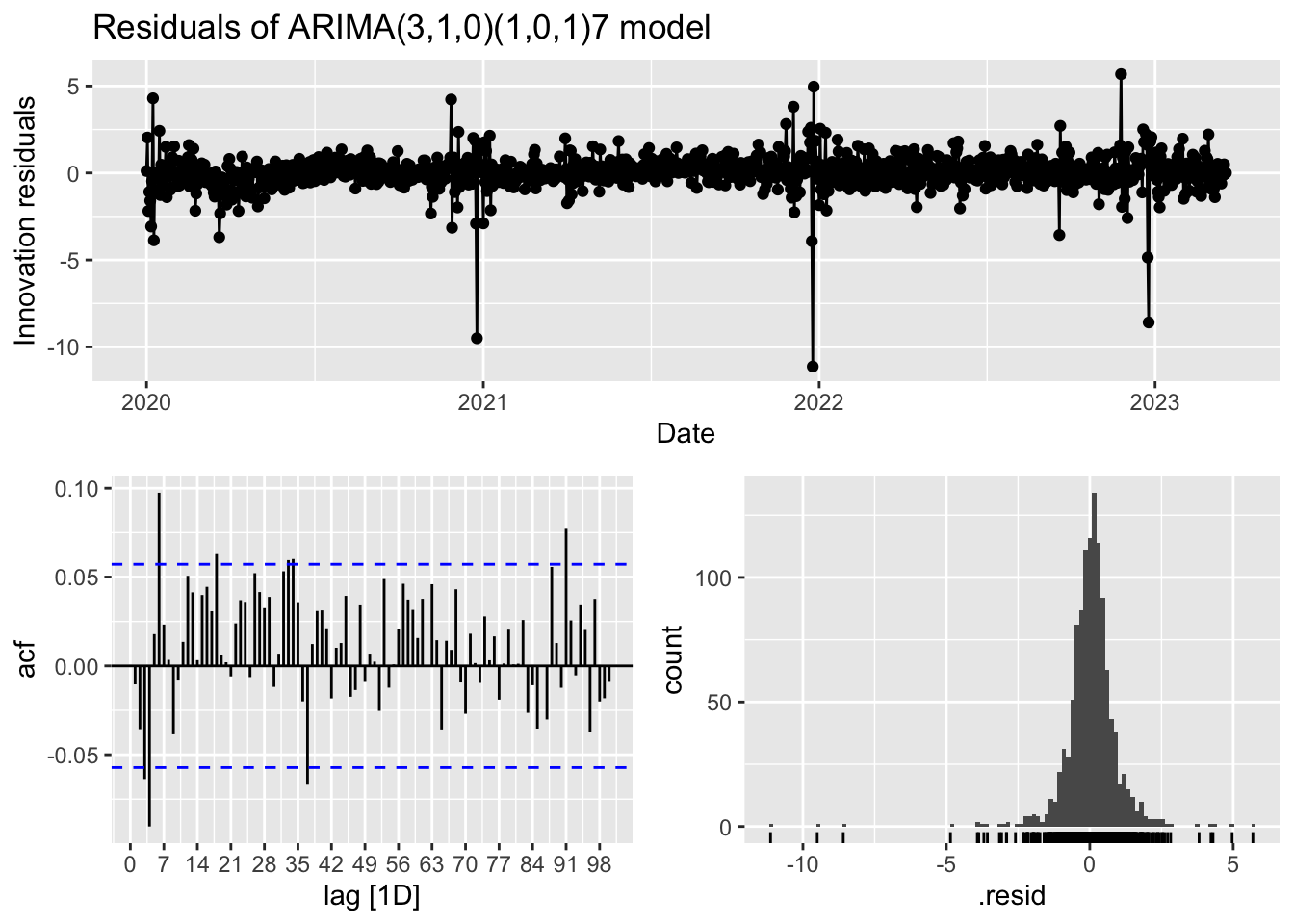
# A tibble: 1 × 3
.model lb_stat lb_pvalue
<chr> <dbl> <dbl>
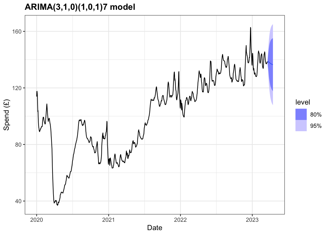
1 search 133. 0.00420Although this model does not pass all of the residual tests we can still use it to forecast, bearing in mind the limitations concerning the accuracy of prediction intervals. Forecasts for the next 28 days are shown below.
Prophet
For an alternative approach, I have chosen to use Meta’s Prophet tool for forecasting time series data based on an additive model where non-linear trends are fit with yearly, weekly, and daily seasonality, plus holiday effects.
In order to use package, the dataset had to be modified so the date variable was renamed ‘ds’ and the total variable as ‘y’. In addition, Prophet allows for custom holidays to be added to the model to take into account national holidays that occur. The holidays function can also be used to deal with systemic shocks that would impact a time series so as to prevent the trend component capturing any peaks or troughs in the data. As such, I have created an additional tibble that holds the dates for the three UK lockdowns and the period of restrictions in place following the emergence of the omicron variant of COVID-19.
# A tsibble: 5 x 2 [1D]
  ds             y
  <date>     <dbl>
1 2020-01-01  114.
2 2020-01-02  118.
3 2020-01-03  118.
4 2020-01-04  116.
5 2020-01-05  114.
# A tibble: 4 × 5
holiday ds lower_window ds_upper upper_window
<chr> <date> <dbl> <date> <dbl>
1 lockdown_1 2020-03-26 0 2020-05-11 0
2 lockdown_2 2020-11-05 0 2020-12-02 0
3 lockdown_3 2021-01-05 0 2021-05-17 0
4 omicron 2021-12-08 0 2022-02-24 0With the data set up to, I started by modelling the time series with limited changes to the available parameters. However, the changepoint_prior_scale parameter was increased to make the trend more flexible and the seasonality mode changed from additive to multiplicative.
m <- prophet(df, changepoint.prior.scale = 0.3, holidays = lockdowns, seasonality.mode = "multiplicative")

future <- make_future_dataframe(m, periods = 28)

forecast <- predict(m, future)

plot(m, forecast)+
    labs(title = "Prophet multiplicative model",
         y="Spend (£)",
        x="Date")+
  theme_bw()+
  theme(plot.title = element_text(face="bold"))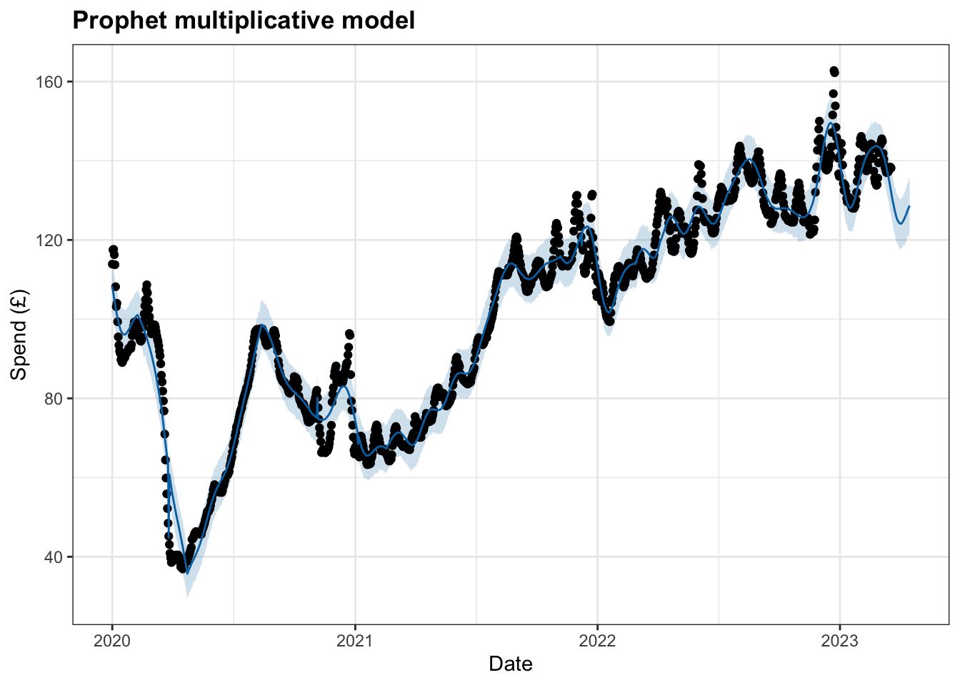
This interactive plot allows for the model to be viewed in more detail:
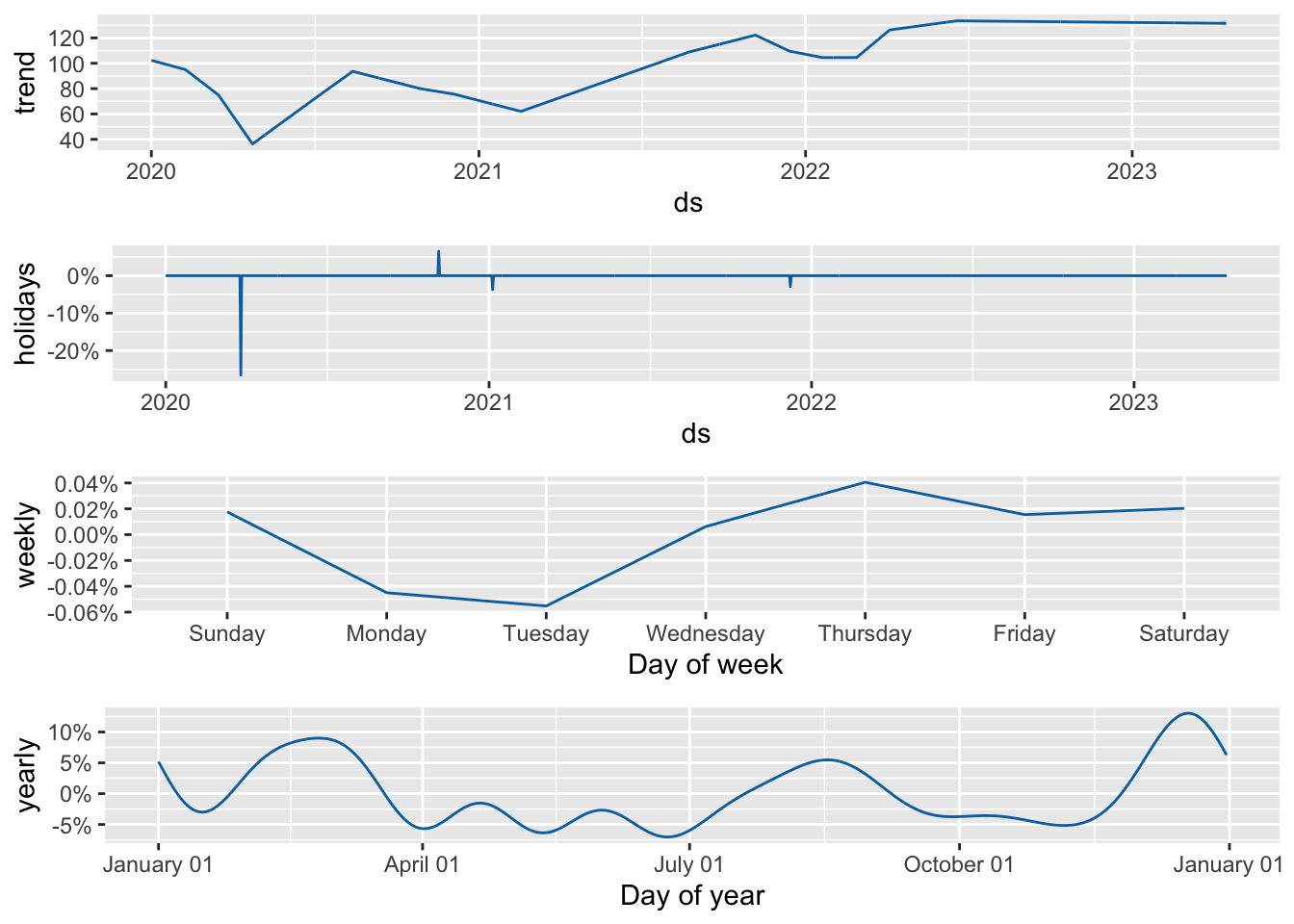
Using Prophet we are able to decompose the model and look at each component separately.
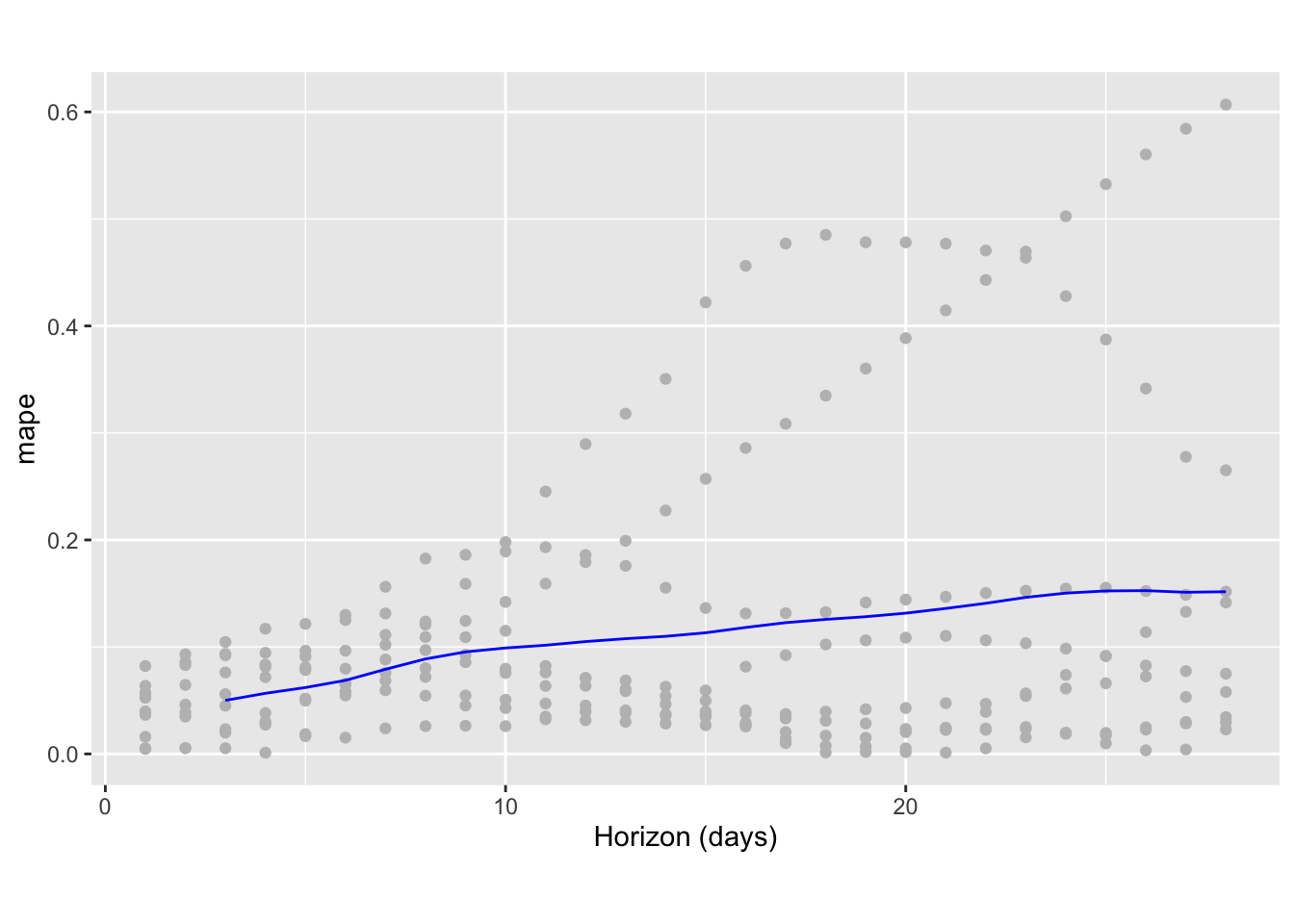
Finally, using cross-validation we can measure forecast error against historical data in a method akin to a rolling forecast origin used earlier. With Prophet I have chosen to select an initial period of 400 days (i.e. up to early February 2021) and made predictions every 90 days for a forecast horizon of 28 days. Based on the current time series, this corresponded to 9 forecasts.
df.cv <- cross_validation(m, initial = 400, period = 90, horizon = 28, units = 'days')Once computed, we can visualise a range of statistics of prediction performance. In the plot below, the dots show the absolute percentage error and the blue line the mean absolute percentage error over the forecast horizon. Forecast error here remains up to 10% for the first 12 days but then steadily increases to a maximum of around 15% for predictions 28 days out.
  horizon       mse      rmse       mae       mape      mdape      smape
1  3 days  41.00205  6.403284  5.424640 0.05005081 0.04513999 0.05071951
2  4 days  54.55002  7.385799  6.271378 0.05666009 0.04609069 0.05749919
3  5 days  67.05754  8.188867  7.034154 0.06205384 0.05589260 0.06309027
4  6 days  83.74800  9.151393  7.977976 0.06876534 0.06562857 0.07001672
5  7 days 113.42346 10.650045  9.379767 0.07910440 0.07579380 0.08061358
6  8 days 148.41528 12.182581 10.719817 0.08878131 0.08017642 0.09073356
   coverage
1 0.4355556
2 0.3644444
3 0.2933333
4 0.2133333
5 0.1422222
6 0.1111111